The Brain
Ask in plain language and see exactly why each track made the cut.
SynAmp Spectrum · v1
Tokens, type, colour and every component the marketing site and the app share. One gold signal, one spectrum, on a deep slate ground — with AA contrast enforced throughout.
Four layers: neutrals carry 70–90% of the pixels, one gold signal, a semantic set, and the spectrum — the brand's single decorative asset, reserved for the amp light and the visualizer.
At most two visible uses of gold per screen — typically one eyebrow and one primary action. The spectrum appears only in the amp light and the visualizer, never as a page wash or on body text.
Spacing is a 4px scale; radii run 4 → 20px; motion uses two easings and four durations and collapses under reduced-motion.
Spacing
Radii & elevation
--dur-1 120ms · --dur-2 200ms · --dur-3 320ms · --dur-4 520ms
--ease cubic-bezier(.2,0,0,1)
Momo Trust Display for headlines (single 400 weight — hierarchy comes from size and colour), Space Grotesk for body and UI, JetBrains Mono for labels, values and ledgers.
ALL CAPS always carries +0.06em or more. Latin display tightens to −0.02em; CJK stays at 0 tracking with line-height 1.3–1.4, including cover titles. Never fake italics — Momo has one weight and no oblique, so emphasis is colour and weight.
One primary action per viewport. Hover moves the background, never the label toward the background. Minimum touch target is 44px.
Every control defines focus-visible and error states. Labels are mono, uppercase and tracked; hints use muted ink, errors use the AA-safe danger ink with an icon.
Chips filter and toggle; tags label; badges carry status. The same vocabulary runs from the marketing site to the app.
Cards group; panels expose a head and body; callouts carry a single note. No coloured left-border tiles — structure comes from borders and surface steps.
Ask in plain language and see exactly why each track made the cut.
Shuffle a whole branch of playlists, recursively.
Recessed surface for persistent chrome and inputs.
Panel body content sits below a hairline divider.
For the one thing the reader must not miss on a page.
This proposal can't be applied as it stands.
Writing to the library is the riskiest thing SynAmp does.
Progress always shows filled encoding, never an empty outline. Metrics lead with the number; tables are dense but readable.
| Track | BPM | Energy |
|---|---|---|
| Dreams | 121 | 0.48 |
| Weightless | 78 | 0.21 |
| Teardrop | 77 | 0.36 |
| Svefn-g-englar | — | — |
Toasts confirm, dialogs interrupt, tooltips explain, empty states direct. All of them are keyboard reachable and announce politely.
Create a playlist to collect tracks, or a folder to group them. Roll-ups turn a whole branch into one live list.
Skeleton & inline code
Run synamp-sync, then press ⌘ K to search.
A quiet note for secondary information.
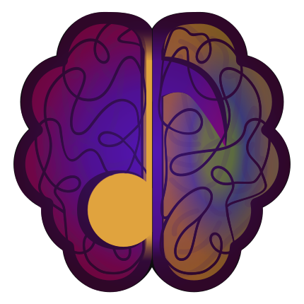
A spectrum brain with a music note, tilted −9° with a thin light edge (it straightens on hover and keyboard focus), beside a coral-to-gold wordmark. The mark and the wordmark are separate files (synamp-mark.svg, synamp-wordmark.svg) so either can change on its own (the old combined synamp-logo.svg still has the first mark — don’t use it). Use the mark alone for favicons and app tiles.

x on all sides, where x is one quarter of the icon height.Accessibility is a gate, not a feature. Contrast, focus, motion and touch targets are enforced in the tokens themselves.
| Pair | Ratio | Verdict |
|---|---|---|
| --fg #F1F1F1 on --bg #212637 | 13.3:1 | AAA |
| --muted #9AA1B8 on --bg | 5.84:1 | AA |
| --gold #FFCD00 on --ink #0E0E10 | 12.8:1 | AAA |
| --on-gold on --gold (button text) | 12.8:1 | AAA |
| --coral #FF4A47 on --bg | 4.53:1 | AA · large |
| --faint #6E7690 on --bg | 3.33:1 | Decorative only |
Every focusable element shows a 2px gold focus ring with a 2px offset. The full journey — nav, tabs, accordions, forms, dialogs — is keyboard operable; dialogs trap focus natively and close on Escape.
The visualizer never autoplays sound, and stays still under prefers-reduced-motion, Save-Data or a slow connection, with an explicit opt-in. All transitions collapse to near-zero under reduced-motion.
Interactive targets are 44px minimum. Body text never drops below 15px on mobile; nothing relies on colour alone — status always pairs a dot with a word.
Landmarks, a skip link, table captions, labelled inputs, descriptive alt text and aria-selected/aria-current state keep the page legible to assistive tech.